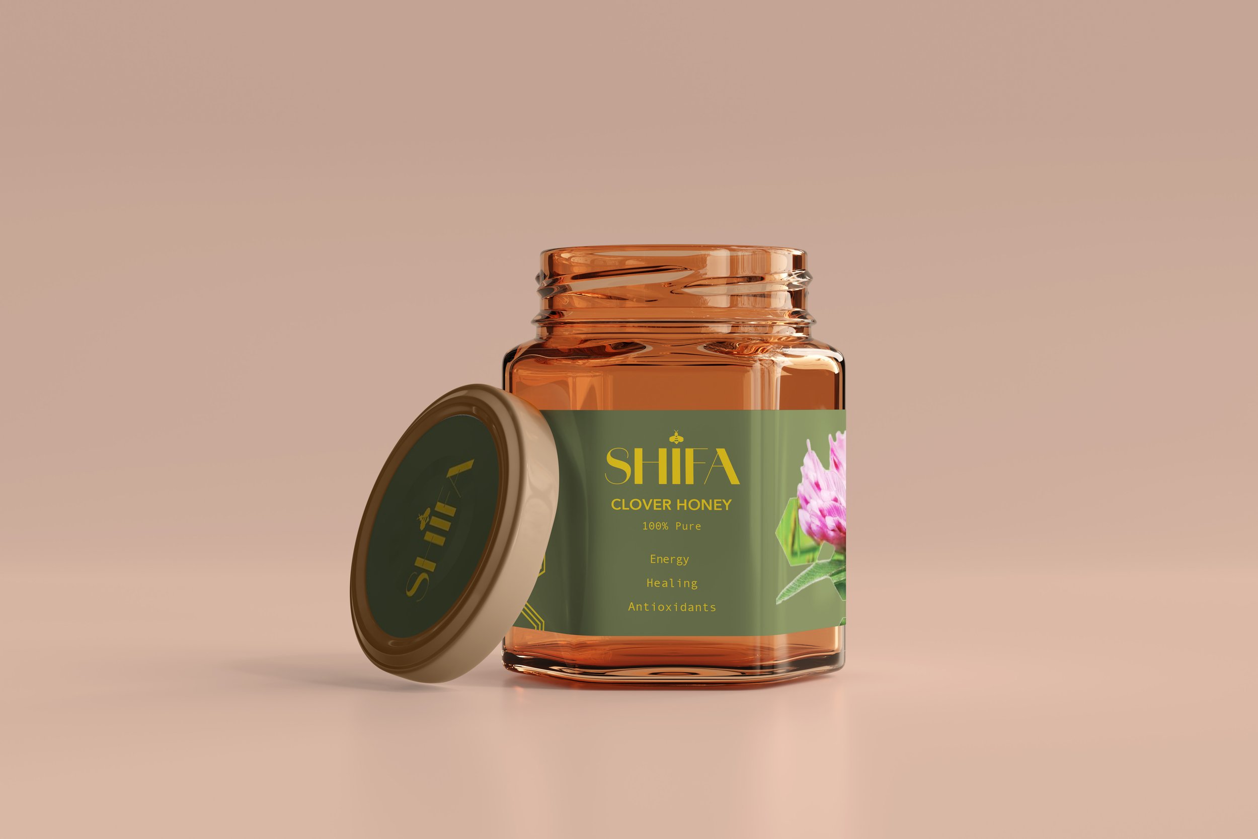
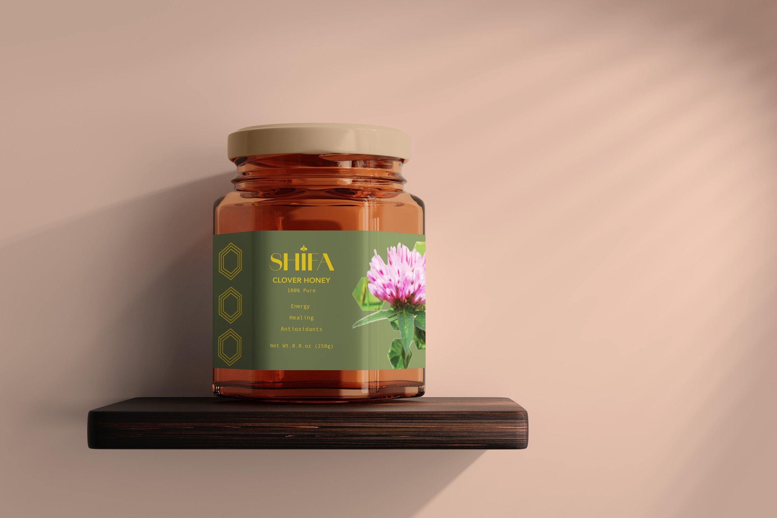
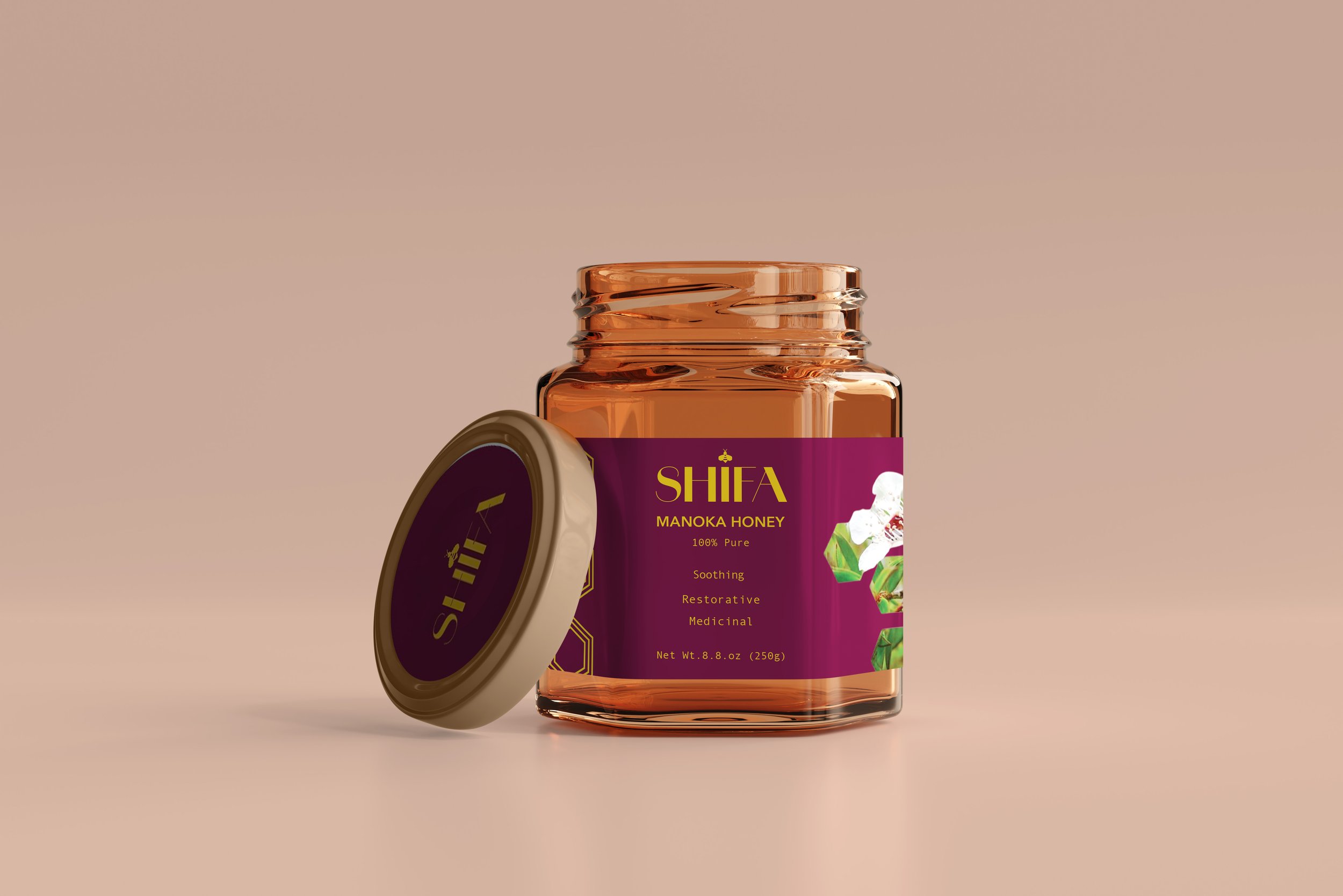
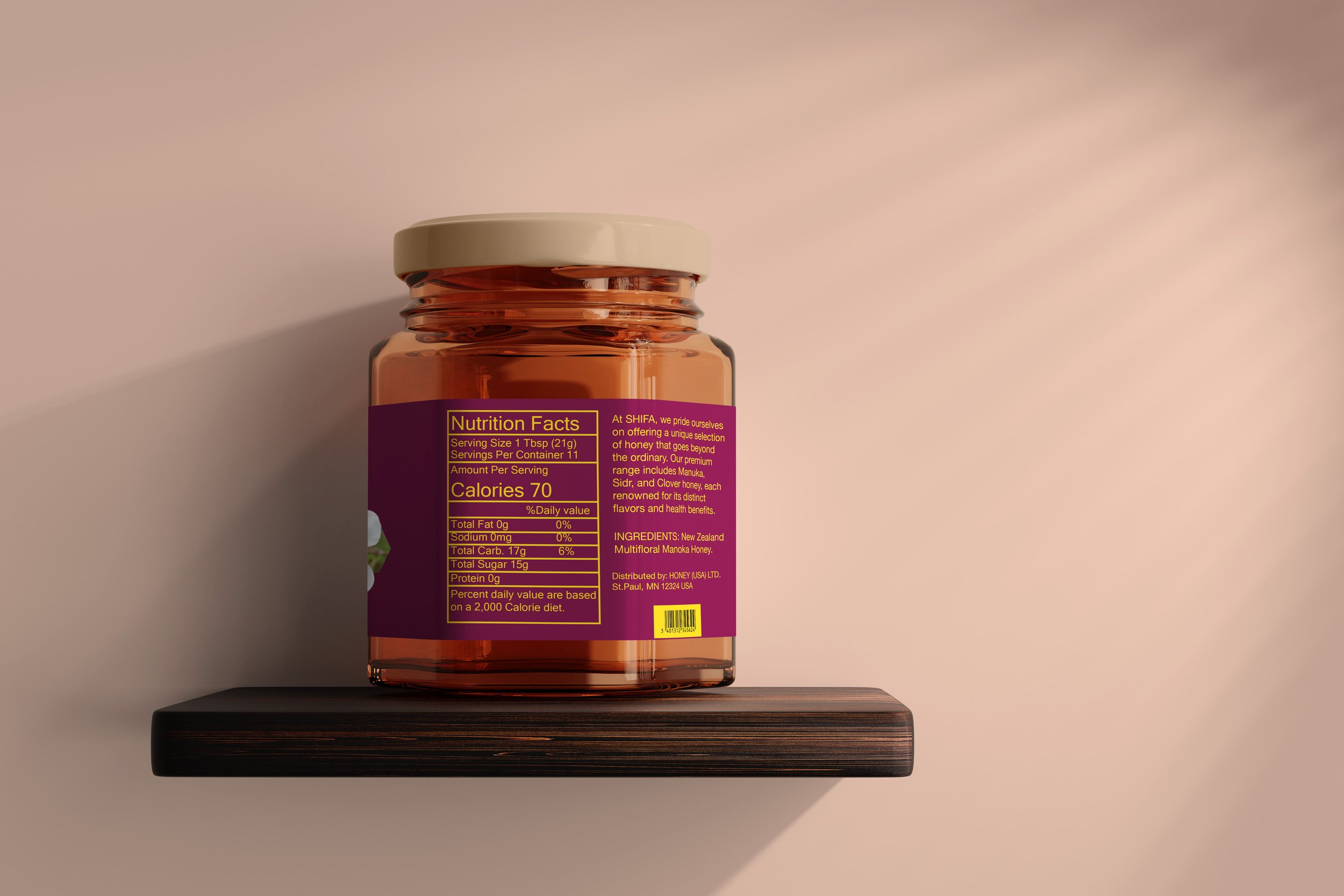
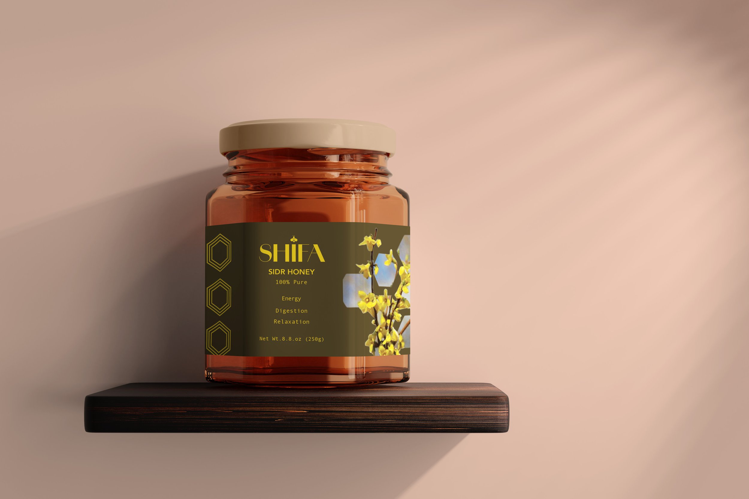
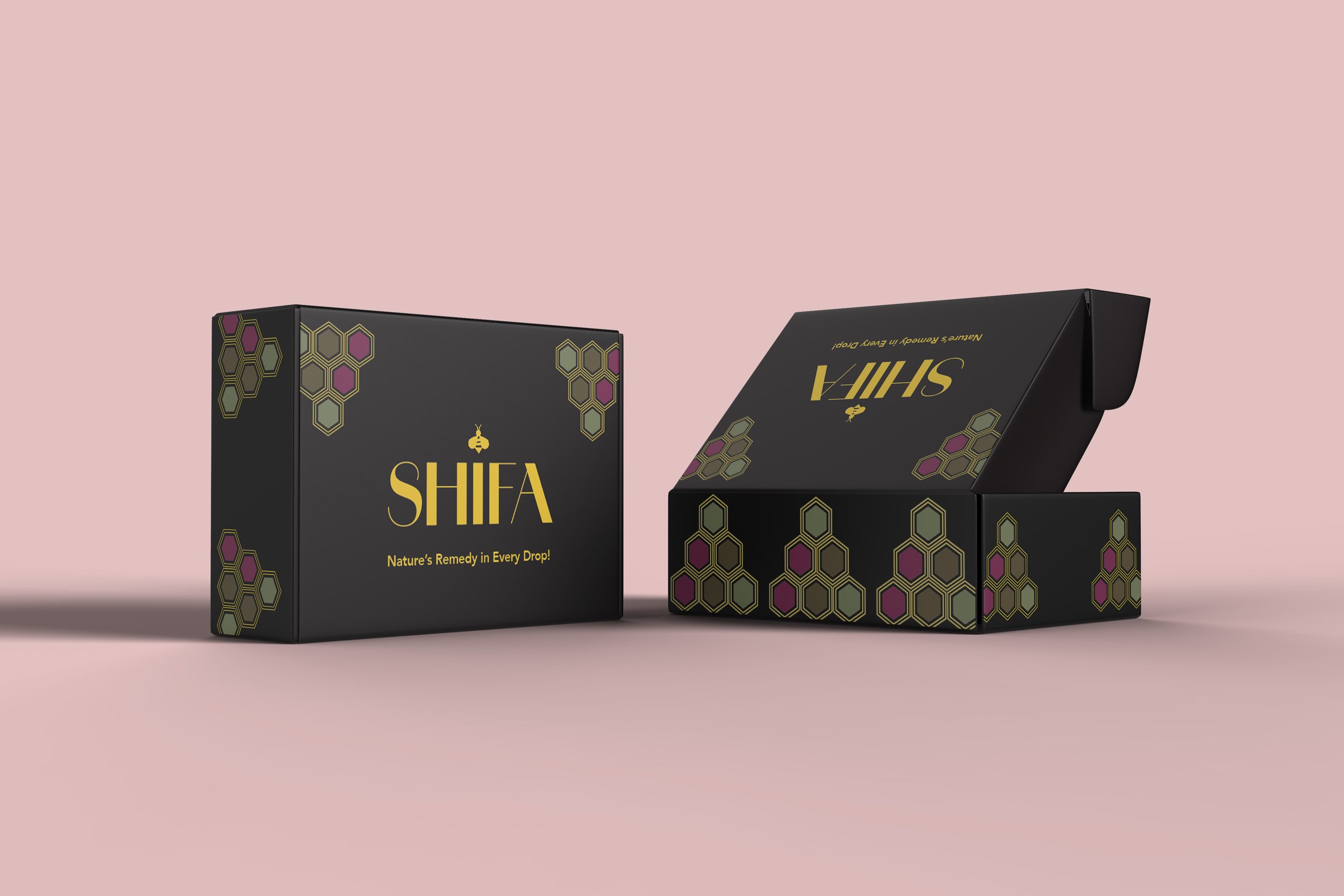
I designed a project about liquid assets that encompass three distinct jars of honey for a brand identified as Shifa. This initiative integrates three varieties of honey that are pivotal for therapeutic purposes. The principal emphasis of this design was on the distinctive floral associations linked to each honey type, as well as the color palette employed in the typography. The design sought to not only underscore the medicinal attributes of the honey but also to establish a product that is visually captivating and conspicuous on retail shelves. Through the incorporation of natural elements and principles of color psychology, the project adeptly encapsulated the essence of Shifa's brand and its dedication to excellence and holistic wellness.
